Understanding the essence of shading letters
The interplay of light, shadow, and luxury in letterforms
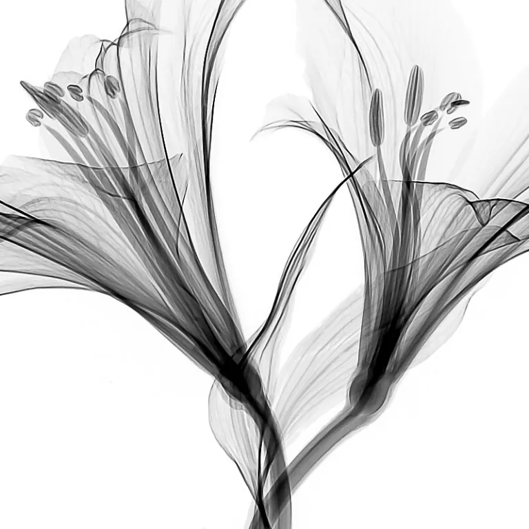
In the world of luxury artwork, the subtle art of shading letters is more than a decorative flourish. It is a sophisticated dance between light and shadow, where every line, curve, and space is thoughtfully considered. Shading transforms simple lettering into a tactile experience, inviting the viewer to appreciate the depth and dimension that shadows bring to the letterforms. The placement of a shadow, the choice of a light source, and the deliberate use of color or metallic accents all contribute to the allure of shaded letters.
Artists and designers use a variety of tools—pens, brush pens, gel pens, and even metallic inks—to add shadows and highlights. The process often begins with hand lettering, where the artist carefully considers the direction of the light source. By leaving space and adding a drop shade or a subtle gray shadow, the letter comes alive, casting an illusion of depth onto the paper. The choice of paper, the texture, and the color palette—whether classic black, light gray, or shimmering metallic—can dramatically influence the final effect.
Shading is not just about technique; it’s about intention. The way shadows are placed, the thickness of shadow lines, and the interplay between colors and light all contribute to the overall design. Mastery of these elements distinguishes luxury artwork, making each piece unique and desirable for collectors and enthusiasts alike. For those interested in a deeper exploration of the luminous qualities of design and print, the art of illumine design offers further insight into how light and shadow elevate luxury lettering styles.
Historical influences on shaded lettering in luxury art
Shaded Lettering Through the Ages
Luxury artwork has always been a canvas for innovation, and the evolution of shaded lettering is a testament to this creative journey. The interplay of light and shadow in letter design can be traced back to illuminated manuscripts, where scribes used subtle gray shadow and drop shade effects to give depth to hand lettering. Over centuries, these techniques evolved, influenced by changes in available materials like metallic inks, brush pens, and specialized paper. The use of metallic shadows and gel pens in contemporary works echoes the opulence of gilded letters from historical scripts.
In the 19th and 20th centuries, the rise of advertising and sign painting brought new attention to shadow placement and the art of adding shadows to letters. Artists experimented with brush, pen, and color to create dynamic shadow lines and highlight the importance of the light source. This era saw the birth of many lettering styles that are still admired in luxury artwork today.
- Shadow placement: Artists learned to leave space and use light gray or black to add depth, making each letter stand out.
- Materials: The transition from quills to brush pens and gel pens allowed for more precise shadow lines and a wider range of colors.
- Design evolution: The integration of metallic and colored shadows became a hallmark of luxury, especially in bespoke commissions.
Today, the legacy of these historical influences is evident in the way artists approach lettering shadow and the use of light and shadow to create a sense of movement and exclusivity. For a deeper exploration of how historical techniques inform modern luxury artwork, you can read more in this insightful article on the artistry of concierge constellation paint.
Techniques and materials for exquisite shading
Mastering the Play of Light and Shadow
Creating luxurious shaded letters is a delicate dance between light, shadow, and the artist’s hand. The choice of materials and the precision of technique are what set high-end lettering apart, transforming simple letters into captivating works of art. Understanding how to add shadows and highlights, and how to manipulate the light source, is essential for achieving depth and sophistication in every letter.
- Pens and Brush Pens: Artists often select premium brush pens or fine-tip pens for their ability to create fluid, expressive lines. Brush pens are especially valued for their versatility in producing both bold and subtle strokes, allowing for seamless transitions between light and shadow.
- Paper Selection: The texture and color of paper play a crucial role. Smooth, heavyweight papers are favored for their ability to showcase crisp lines and vibrant colors, while specialty papers with a hint of metallic finish can add a refined shimmer to shadowed areas.
- Color and Metallic Accents: While classic black and light gray shadows remain timeless, luxury artwork often incorporates metallic shades—such as gold or silver gel pens—to elevate the design. These metallic shadows catch the light, adding a dynamic, opulent effect to the lettering.
- Shadow Placement: The placement of shadows is meticulously planned. Artists leave space strategically, ensuring that the shadow lines follow a consistent light source. This attention to detail creates a convincing three-dimensional effect, making the letters appear to float above the surface.
- Layering and Blending: Adding shadows is not just about drawing a line. It involves layering colors, blending with brush pens, and sometimes using a drop shade technique to intensify depth. The interplay of gray shadow and color can dramatically alter the mood and impact of the piece.
For those who appreciate refined interiors, the synergy between shaded lettering and luxury décor is undeniable. Pairing a bespoke hand lettering piece with elegant accessories, such as a ceramic candle holder, can further elevate the ambiance, highlighting the interplay of light and shadow in both art and environment.
Ultimately, the mastery of shading in luxury lettering comes down to a blend of expert technique, thoughtful material selection, and a keen eye for design. Each shadow, each line, and each color choice contributes to the overall allure, making every letter a testament to the artist’s skill and vision.
The role of shading in bespoke commissions
Personalization through Shadow and Light
In the world of luxury artwork, bespoke commissions are where the true artistry of shaded lettering comes alive. Each project is a unique collaboration between artist and collector, with the interplay of shadow, light, and color tailored to reflect personal taste and the intended atmosphere of the space.Designing for Individual Expression
When creating custom pieces, artists carefully consider the choice of lettering styles and the placement of shadows. The selection of pens, brush pens, or even metallic gel pens is not just about technique—it’s about capturing the essence of the client’s vision. The direction of the light source, the depth of the shadow lines, and the subtlety of a light gray or bold black shade all contribute to the final impression.- Shadow placement: Artists analyze where to add shadows to enhance the dimensionality of each letter, ensuring the shadow will complement the overall design.
- Material selection: The choice of paper, from smooth to textured, and the use of metallic colors or classic black, can dramatically affect how shadows lettering interacts with light.
- Hand lettering techniques: The pressure applied with a brush pen or the layering of color with gel pens allows for a range of effects, from soft gray shadow to striking drop shade.
Elevating the Experience with Custom Details
Bespoke luxury artwork often involves leaving space around letters to let shadows breathe, or using metallic shadows to add a sense of opulence. The artist’s hand guides every line, ensuring that each shadow placement is intentional and harmonious with the overall composition. This attention to detail is what sets luxury commissions apart, transforming simple letters into captivating works of art. Collectors appreciate how adding shadows and thoughtful design choices can turn a name, phrase, or monogram into a statement piece. The result is a personalized artwork where every curve, shade, and highlight is a testament to craftsmanship and individuality.Notable artists and studios mastering shaded letters
Studios and Artists Setting the Standard in Shaded Lettering
Within the world of luxury artwork, certain artists and studios have become synonymous with mastery in shaded lettering. Their approach is defined by a deep understanding of how shadow, light, and color interact on paper, metal, or canvas. These creators elevate hand lettering into a sophisticated art form, using every tool at their disposal—from brush pens and gel pens to metallic inks and specialty papers.
- Precision in Shadow Placement: Leading studios are meticulous about where they add shadows. The angle of the light source, the thickness of the letter, and the intended mood all influence shadow lines and drop shade effects. By leaving space strategically and using light gray or black for subtle gray shadow, they create depth that feels both deliberate and effortless.
- Material Innovation: The best in the field experiment with brush pens, metallic colors, and specialty papers. Metallic shadows, for example, can add a luminous quality that shifts with the viewer’s perspective, while high-quality paper ensures the crispness of every line and shade.
- Signature Lettering Styles: Each artist or studio develops a unique approach to hand lettering and shadows. Some favor bold, dramatic contrasts with black or deep colors, while others prefer soft, layered effects using brush pen and light gray tones. The choice of pens, brush, and even the direction of the shadow will define the final design.
These experts often share their process, revealing how they add shadows, layer colors, and use shadow lines to enhance the form of each letter. Their work is a testament to the importance of technique and vision in luxury artwork, inspiring collectors and enthusiasts to appreciate the subtle artistry behind every shaded letter.
How to appreciate and collect shaded letter artwork
Spotting Excellence in Shaded Lettering
When you encounter luxury artwork featuring shaded letters, the first thing to notice is the harmony between shadow and light. True mastery in this art form is revealed through the subtle interplay of shadow placement and the way light source is considered. The best pieces often leave space strategically, allowing the letters to breathe and the shadows to enhance, not overpower, the design.
Key Elements to Observe
- Lettering styles: Look for consistency in the style and how the shadow lines follow the contours of each letter.
- Shadow lines and drop shade: Examine the precision of the shadow lines. A well-executed drop shade or gray shadow adds depth without muddying the color of the letters.
- Materials: High-end works often use premium paper, metallic accents, and specialty pens or brush pens. Metallic shadows or gel pens can add a luxurious shimmer.
- Color and contrast: Observe how the artist uses black, light gray, or color to create contrast. The choice of color for shadows lettering can dramatically affect the mood.
- Technique: Notice if the shading is achieved by hand, with brush pens, or through a combination of tools. Hand lettering with carefully adding shadows shows a high level of skill.
Building a Collection
For collectors, focus on acquiring pieces where the artist demonstrates a deep understanding of light, shadow, and the nuances of hand lettering. Seek out works where the brush, pen, and paper come together seamlessly, and where the design feels intentional. Limited editions or bespoke commissions often showcase the most exquisite shading techniques, especially when artists experiment with metallic or colored shadows.
When evaluating a piece, consider the following:
- How does the shadow will interact with the letter form?
- Does the artist add shadows in a way that enhances the overall composition?
- Is the use of brush pens or gel pens adding a unique texture or finish?
Engaging with the Artwork
To truly appreciate shaded letter artwork, view the piece in different lighting conditions. The interplay of light and shadows hand applied by the artist can reveal new dimensions. If possible, discuss with the artist or studio about their process—understanding their approach to shadow placement and the materials used will deepen your appreciation and inform your collecting decisions.
