How to Hang Art at Home with Museum-Level Precision
Hanging art in a home with museum-level precision starts with a clear eye-level guideline, then adapts to your furniture, ceiling height, lighting, and the way people actually move through the room.
Quick rule of thumb for eye level
- Standard viewing height: place the artwork center around 145–150 cm (about 57–59 inches) from the floor.
- Seated rooms (dining, TV): drop the center slightly, to around 140–145 cm.
- Very tall rooms: keep at least one key piece in that same band, then let secondary works rise above.
Use this band as a flexible reference, not a rigid rule, and adjust a few centimeters up or down to suit each wall, piece of furniture, and the height of the people who use the space.

Why museum eye level is a guide, not a law
Museum curators rarely improvise when they install exhibitions, and the same discipline should govern any serious private wall. The standard reference for hanging artwork is a center line at about 147 cm, or roughly 58 inches from the floor, because that eye level suits an average adult viewer standing in a calm room and keeps the visual field stable across different walls. This convention appears in many institutional guidelines and design handbooks, which often cite a 145–150 cm band as the typical sight line for gallery displays. When you plan wall art placement at home, treat that 58-inch eye level as a starting grid, then adjust the height by a few inches up or down depending on the furniture, the room function, and whether people mostly sit or stand in that space.
Look at how the Museum of Modern Art aligns each picture so the center of every piece of art sits on a continuous invisible band, even when the frames and artwork sizes vary wildly. That is the discipline you want when you hang artwork in a living room or a long hallway at home, because a consistent center height calms the walls and lets each piece become a focal point rather than visual noise that feels too high or too low. In a dining room where guests remain seated, that center might drop to around 140 cm, while in a double-height entrance hall you can push the art slightly higher, but still keep the main picture center within a comfortable eye-level band for most of the house.
Designers often forget that the viewer’s body, not the wall, sets the rules for arranging pictures at home. A low sofa or a tall piece of furniture like a sideboard shifts the perceived level of the artwork, so you may need to compress the gap between the furniture and the frame to about 15 to 25 cm rather than clinging to a rigid 58-inch floor measurement. When you hang art above substantial furniture such as a console or a credenza, think of the furniture top as a secondary horizon line and let the artwork center float between that surface and the global eye level, so the whole composition reads as one coherent piece rather than a picture awkwardly stranded in empty space. In family rooms or children’s spaces, you can also lower the center line slightly so younger viewers and seated guests experience the work comfortably without craning their necks.
Single statement versus salon style: when walls should whisper or shout
Every serious collector eventually faces the choice between a single commanding piece and a dense salon-style hang, and the right answer depends less on the artwork count than on the room volume. A solitary large piece of art on a quiet wall can turn a modest living room into a private gallery, especially when the picture center sits at eye level and the surrounding space stays clean so the work becomes the undeniable focal point of the house. By contrast, salon-style gallery walls, with multiple artworks stacked from about 90 cm to 210 cm above the floor, suit intimate rooms where you want the walls to feel like a lived-in archive rather than a white cube.
Consider the way Jacques Grange handled the gallery wall in the Yves Saint Laurent rue de Babylone salon, where portraits, drawings, and small paintings climb the walls in a loose grid yet still respect a central band of eye-level centers. That salon-style arrangement works because each picture is aligned either by its center or by its frame edges, and the gaps between frames stay relatively consistent, usually around 5 to 8 cm, so the art hanging reads as one composed field instead of random clutter. When you attempt a similar gallery wall at home, lay the pieces on the floor first, build a strong center line, then let smaller works step upward and downward in measured inches, always keeping the visual weight balanced around a clear center of gravity.
For more playful projects, such as arranging seasonal works or even refined pumpkin-based creations, a salon-style cluster can frame a temporary story without overwhelming the room. A thoughtful example is using a niche or side wall to create a compact gallery wall around a console that displays sculptural objects, perhaps echoing ideas from a guide to elevated decorative artistry on unexpected surfaces. The key is that even in these looser hangs, you still respect a notional eye-level band and avoid letting any picture drift so high that the viewer must crane the neck, or so low that the artwork fights with the baseboards and floor measurements instead of conversing with the furniture and the people in the room.
Light, color and the physics of seeing artwork at home
Nothing sabotages a carefully planned art display faster than poor lighting, yet many luxury houses still rely on generic ceiling spots that flatten color and texture. Works on paper generally prefer around 150 to 200 lux, while oil paintings can tolerate closer to 300 lux, and in both cases you want a color rendering index of at least 90 with proper UV filtering to protect the artwork over time. These ranges align with conservation guidance from major institutions and professional bodies such as the Illuminating Engineering Society (IES) and museum lighting standards, which balance visibility with long-term preservation. When you mount art in a living room or library, aim for adjustable fixtures that let you fine-tune the light level so the picture glows gently rather than blasting the walls with harsh beams that create hot spots and deep shadows.
Track lighting is often installed as a default, but in residential rooms the tracks are frequently placed too close to the walls, which forces steep angles that cause glare on glass and uneven illumination across the piece. A better strategy is to position ceiling junctions about 60 to 90 cm out from the wall, then use directional heads to wash the artwork evenly from top to bottom, keeping the brightest zone slightly below the top third of the picture so the viewer’s eye settles comfortably near the center. When you plan art placement above a piece of furniture like a sofa or sideboard, check that the beam spread covers both the artwork and a little of the furniture surface, so the whole composition reads as a single lit vignette rather than a floating rectangle of light.
Color relationships matter just as much as lux levels when you display artwork in a sophisticated home. The common mistake is matching the painting to the sofa or rug, which turns the art into décor rather than a focal point with its own authority, whereas a better approach is to let one accent color from the artwork echo subtly in a cushion or object while the rest of the room stays chromatically restrained, as you might plan when pairing a leather armchair with a refined leather bound sketchbook on a side table. Think of the walls as a neutral stage, the furniture as supporting actors, and each piece of art as the lead whose costume should converse with, not copy, the rest of the cast.
Three case studies: how top designers hang art in real rooms
Consider the Manhattan apartment that Peter Marino designed for a major contemporary collector, where a single Gerhard Richter abstraction commands the main living room wall. Marino placed the artwork center close to the 147 cm museum standard, but he tightened the gap between the frame and the low sofa to about 18 cm, so the picture, furniture, and rug form one continuous field rather than three separate stripes of color. The result is that the art feels both monumental and intimate, proving that precise inches between frame and furniture can matter more than the overall wall height in a well-proportioned space.
In contrast, Axel Vervoordt’s work at the Kanaal complex in Belgium shows how to use gallery walls in tall rooms without losing human scale. He often hangs a vertical sequence of works along a stair or double-height wall, yet he keeps at least one key piece centered around eye level on each landing, so the viewer always encounters a focal point at a comfortable viewing height before the gaze travels upward to secondary works. That strategy translates beautifully when arranging art at home in stairwells or mezzanines, where you can let some pieces rise high while still anchoring the composition with one or two artworks whose centers sit around 145 to 150 cm from the finished floor.
A third instructive example is the London townhouse curated by David Mlinaric for a client with a mix of Old Masters and contemporary photography. In the dining room he created a salon-style arrangement of portraits above a long sideboard, aligning the lower row so the frame bottoms sit about 25 to 30 cm above the furniture top, then stacking additional pictures upward while keeping the central faces near eye level for seated guests, and this kind of calibrated hanging shows how a dense wall can still feel legible and calm. When you study these projects, you see that successful art placement at home is less about rigid rules and more about consistent internal logic, where every picture, every piece of furniture, and every patch of wall space participates in a deliberate visual rhythm.
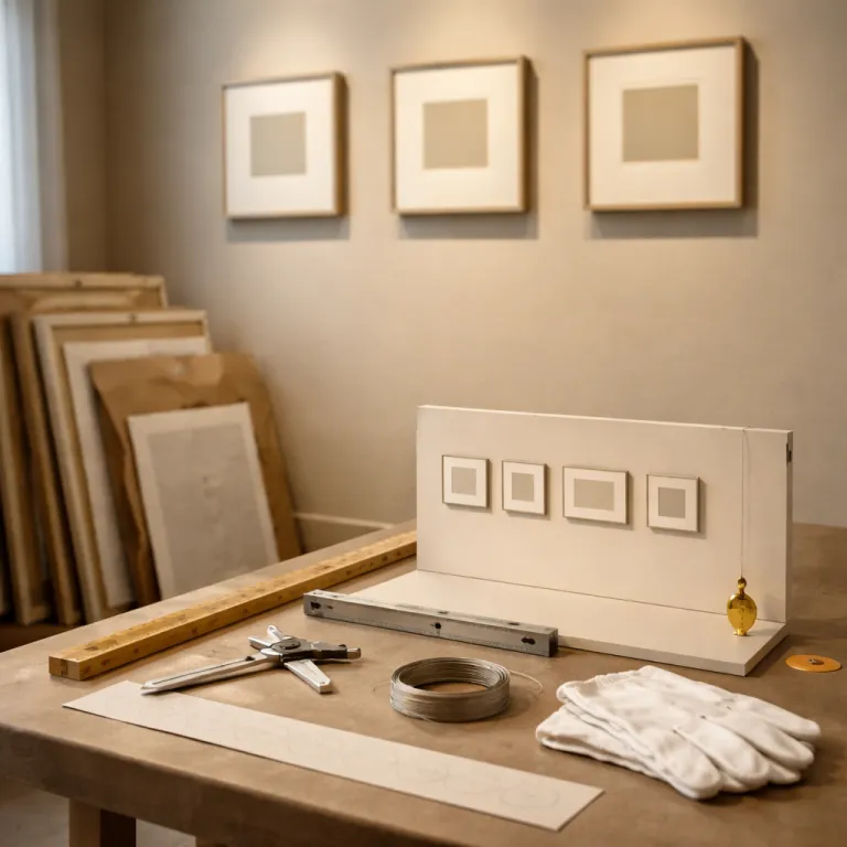
A curator’s checklist for hanging art at home
Before you lift a hammer or adjust a hanging wire, walk the room and decide which wall should carry the primary focal point, because not every surface deserves a major piece. Mark a provisional eye-level line at about 147 cm, then test different artworks by holding them so their centers sit on that band, paying attention to how the picture relates to nearby furniture, doorways, and windows. If a work feels too high or low, adjust in small increments of 2 to 3 inches rather than big jumps, and keep notes of the final height so you can repeat that successful level on other walls across the house.
When planning a gallery wall, start with the anchor artwork at the center, then build outward with secondary pieces, always keeping the gaps between frames consistent and the overall silhouette roughly rectangular or oval rather than random. Lay the entire composition on the floor first, measure the total width and height, and lightly tape that footprint onto the wall so you know exactly where each piece will hang before you commit to hooks, which helps avoid the dreaded regret of extra holes and chaotic spacing. Remember that a salon-style arrangement works best on a single uninterrupted wall, while adjacent walls in the same room might benefit from quieter single hangs to give the eye places to rest.
Lighting and maintenance complete the checklist for hanging art at home that truly respects the work. Specify fixtures with at least CRI 90, set dimmers so works on paper never exceed about 200 lux, and ensure that any direct daylight is filtered to protect pigments and paper fibers over the long term, then revisit the hang after a few days of living with it to confirm that the artwork still feels balanced at different times of day. For deeper guidance on elevating a specific wall into a refined visual statement, you can study approaches to curating a distinctive decorative wall in a luxury interior, and apply the same rigor to every picture, every piece of art, and every centimeter of wall space in your own rooms.
FAQ
What is the best height for hanging art above a sofa or console ?
For hanging art at home above a sofa or console, aim to keep the bottom of the frame about 15 to 25 cm above the furniture top, then check that the artwork center lands close to the 145 to 150 cm eye-level band. This usually means the picture feels visually connected to the piece of furniture without crowding it, and the overall wall composition stays comfortable for seated and standing viewers in the room.
How high should I hang artwork in a room with very tall ceilings ?
In rooms with tall or double-height ceilings, keep at least one key artwork centered around the standard 147 cm eye level, then allow secondary pieces to rise higher as part of a vertical sequence. This approach preserves human scale on the main walls while still taking advantage of the extra space, so the art feels intentional rather than lost in a void of high ceilings.
When does a salon style gallery wall work best in a home ?
A salon-style gallery wall works best on a single uninterrupted wall in a living room, hallway, or stair where you want a dense, narrative display of multiple artworks. It is most successful when you establish a clear center anchor piece, keep consistent gaps of about 5 to 8 cm between frames, and maintain a coherent outer silhouette so the many pictures read as one composed artwork field.
Should art match the colors of my furniture and décor ?
Matching artwork exactly to sofa or curtain colors tends to reduce the art to decoration, which undermines its presence as an independent focal point. A better strategy is to let one or two colors from the artwork echo subtly in cushions or objects while the larger furniture pieces and walls remain more neutral, so the art leads the color story rather than following it.
Is track lighting a good solution for illuminating artwork at home ?
Track lighting can work for hanging art at home if the tracks are positioned about 60 to 90 cm out from the wall and fitted with high-quality heads that offer CRI 90 or higher and proper beam control. Many residential tracks are installed too close to the walls, which forces steep angles and glare, so placement and specification matter more than the track format itself when you want museum-grade lighting on your walls.
