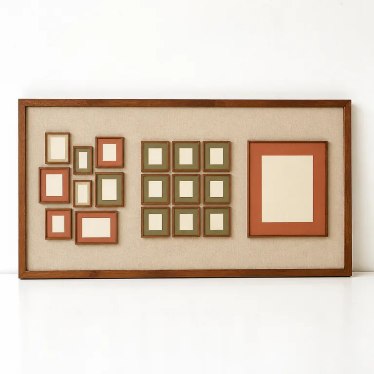
Salon hang layouts when the collection writes the room
A salon hang is the gallery wall layout design that behaves like a lived in archive rather than a decorator’s trick. In a serious art gallery context such as David Zwirner or Hauser & Wirth, this dense wall layout appears in period rooms where drawings, paintings, and prints are allowed to converse across time and medium. On a private wall in a living room or dining room, the same approach can turn scattered art pieces into a single narrative surface.
Think of the wall as a page and each frame as a sentence that must support the overall layout. You might start with one anchor piece of wall art at roughly 145 cm to 150 cm center height, then let smaller frames, photos, and prints radiate around it in a loose room gallery constellation. This kind of gallery wall works best when you mix black and white photography with color works on paper, allowing different pieces and photos to punctuate the walls like visual commas.
For luxury collectors, the salon style is ideal when you own many art pieces of varied sizes that would look lost in strict wall layouts. A salon gallery wall in living rooms can hold family photos, a blue chip print, and a small painting from a Colorado art gallery without any one piece feeling demoted. The key is to hang art with consistent spacing of 4 cm to 7 cm between each frame so the wall layout feels intentional rather than chaotic.
In a ceiling gallery corridor or stair, the salon hang can climb vertically and exploit the full height of the walls. Here, the best design is to keep the visual weight balanced left to right, even as the frames rise toward the ceiling and wrap the space. When you hang art in this way, the room becomes a three dimensional gallery wall that rewards slow looking rather than a single glance.
Lighting must be planned before the first nail touches the wall. Track lighting with adjustable heads works best for salon gallery walls because you can tilt each beam to a specific frame or photo without washing out the entire wall. In a dining room, a combination of a soft ceiling wash and two or three picture lights can give the wall art a gentle glow that flatters both the pieces and the people seated beneath them.
Collectors often worry that salon layouts will feel cluttered in smaller living rooms. The reality is that a dense wall gallery can make a compact space feel curated, provided the lowest frame sits about 20 cm above the back of a sofa or console. When the wall ideas are driven by the art rather than by matching frames, the room reads as a private art gallery rather than a furniture showroom.
Grid layouts when precision and repetition carry the story
A grid is the gallery wall layout design that most clearly borrows from museum practice. In spaces like Gagosian’s photography shows or the rigor of a minimalist art gallery, grids of black and white prints or color photos create a rhythm that feels almost architectural. On a domestic wall, the same grid layout can turn a living room into a quiet viewing room where every piece has equal weight.
Grids work best when the frames are identical and the art pieces share a common format, such as a series of editioned prints or a suite of family photos. For a four by three grid above a sofa in a living room, aim for 6 cm to 8 cm between each frame and keep the overall wall layout centered on the furniture rather than the room itself. The visual discipline of the grid lets the art, not the wall ideas, carry the emotion.
In a dining room, a two by three grid of large photos can act as a single statement while still technically being multiple pieces. Here, the best design is to align the horizontal center of the grid at about 150 cm from the floor, adjusting slightly if the ceiling is unusually high or low. When you hang art in a grid, even modestly priced prints can read like a museum wall because the wall layouts echo institutional standards.
Grids are unforgiving of sloppy measurements, so a laser level and a clear plan are non negotiable. Map the wall layout on kraft paper first, marking each frame outline and testing different display ideas before you commit to drilling. In a ceiling gallery hallway, a long single row grid of black and white photographs can stretch the perceived length of the space, while a double row grid can lower an overly tall wall visually.
Designers should resist the temptation to mix ornate gold frames with slim black metal frames inside a single grid. That kind of frame eclecticism belongs to a salon wall gallery, not to a grid that relies on repetition and calm. If you want variation, let the art pieces shift from color to black and white while the frames and layout stay consistent.
For collectors exploring new artists, a grid can be a disciplined way to build a focused wall gallery over time. You might start with four works from a single photographer, then expand the grid as you acquire more prints that share a format and style. When you are evaluating opportunities such as the open call highlighted in this New York gallery initiative, think about whether the resulting photos or prints could eventually live in a grid without visual strain.
Single statement layouts when one work defines the room
Sometimes the most powerful gallery wall layout design is not a gallery wall at all but a single statement piece. A large painting, a monumental photograph, or a sculptural wall relief can command an entire wall in a living room or dining room without needing supporting pieces. In these cases, the wall layout becomes almost invisible, because the art itself dictates where and how you hang it.
For a single statement work above a sofa, the best rule is to keep the bottom of the frame between 20 cm and 30 cm above the furniture. This keeps the wall art connected to the room’s seating and prevents the piece from floating awkwardly high on the wall. In living rooms with high ceilings, you can cheat this slightly upward, but the center of the piece should still sit close to the 145 cm to 150 cm eye line that museums favor.
Single statement layouts work best when the surrounding walls stay relatively quiet. That does not mean bare walls everywhere, but it does mean avoiding competing gallery walls or busy wall layouts directly adjacent to the hero piece. A small room gallery of prints or family photos can live on a secondary wall, while the main wall holds the one work that defines the space.
Lighting is critical when one piece carries the room. A dedicated picture light or a pair of narrow beam spots from the ceiling can sculpt the surface of the art without spilling too much light onto the rest of the walls. In a ceiling gallery situation such as a double height foyer, consider a triple spot track that can follow the piece if you ever adjust the wall layout or rotate the art.
Collectors working with large scale black and white photography often underestimate how much space a single work needs. A 150 cm wide framed photo will usually require at least 220 cm of clear wall to breathe, especially in compact living rooms. When you hang art of this scale, keep side clearances generous so the frame does not feel squeezed between windows, doors, or other wall art.
Regional scenes such as the high altitude light captured by photographers in Colorado’s luxury art market show how a single landscape can anchor an entire interior. When you study reports on the Colorado luxury art scene, you see how many collectors now commission one large piece instead of several smaller ones. In those cases, the gallery wall becomes a gallery wall in name only, because the wall layout is simply one frame, one story, one decisive gesture.
Choosing between salon, grid, and single statement for each space
The right gallery wall layout design depends less on fashion and more on what the room and the art are asking for. A long living room wall with varied pieces, family photos, and small prints usually favors a salon hang, because the wall layout can flex around windows, doors, and radiators. A compact dining room with a strong central table often suits either a disciplined grid or a single statement, depending on whether you own a series or one dominant piece.
Start by listing what you actually want to hang rather than forcing wall ideas onto the collection. If you have ten to fifteen art pieces in mixed media and sizes, a salon gallery wall will almost always work best, especially in living rooms where people linger and look. If you have six to eight matching frames with related photos or prints, a grid or linear wall gallery may be the better design.
Ceiling height and wall length also push you toward one layout or another. In a ceiling gallery stairwell, the vertical rise of the walls makes a climbing salon hang or a tall single statement more natural than a rigid grid. In a low ceiling family room, a horizontal grid of small black and white photos can visually widen the space and keep the wall art from feeling top heavy.
Designers working on multiple living rooms within the same property often alternate strategies to avoid repetition. One room gallery might be a salon wall of drawings and prints, while another room holds a grid of color photographs and a third relies on a single statement painting. This variety keeps the overall home feeling like a considered art gallery rather than a showroom of identical wall layouts.
When you are building a collection with a clear through line, the layout choice becomes part of the narrative. A focused series of works on paper might live in a grid for several years, then migrate into a salon hang as you add more diverse pieces that expand the story. Resources such as this guide on building a themed collection can help you align wall layout with collecting strategy.
Whatever you choose, don afraid to edit ruthlessly. Not every piece needs to be on the walls at once, and rotating art pieces between storage and display can keep both gallery walls and single statement layouts feeling fresh. The most successful wall gallery arrangements are those where the design recedes and the art quietly takes the lead.
Technical specs that separate professional hangs from amateur walls
Professional gallery wall layout design is less about taste and more about repeatable technical decisions. Museums and serious art gallery teams rely on a few simple rules for wall layout that you can adapt to living rooms, dining rooms, and corridors. Once you understand these specs, your wall art will sit with the same calm authority you see in blue chip spaces.
The so called 145 cm to 150 cm rule places the center of the frame at average eye level, which works best for most living rooms and room gallery situations. In a salon hang, you might anchor one central piece at this height, then let other frames and photos step above and below while still respecting a loose horizontal band. In a grid, every piece shares the same center line or top line, so the wall layouts feel mathematically precise.
Spacing between pieces is where many home hangs fail. For luxury art pieces, aim for 4 cm to 7 cm gaps in salon walls and 6 cm to 8 cm in grids, adjusting slightly for very large or very small works. When you hang art closer than this, the wall can feel cramped, while wider gaps risk breaking the sense of a unified gallery wall.
Hardware matters as much as measurements. Use proper wall anchors rated for at least twice the weight of the frame, especially in ceiling gallery situations where a falling piece could be dangerous. For heavy frames in plaster walls, consider a French cleat system that spreads the load and keeps the wall layout stable over time.
Lighting should be specified with the same care as the frames. Narrow beam spots of 15 to 25 degrees work best for single statement pieces, while wider beams of 30 to 40 degrees suit salon gallery walls and grids of prints or photos. In a dining room, avoid placing downlights directly in front of glossy glass, which can throw distracting reflections across black and white photography and polished frames.
Color temperature is another quiet but decisive factor. Many leading galleries now favor LEDs around 3000K, which keep whites clean while flattering skin tones and warm wall colors in living rooms. When your wall ideas extend across multiple rooms, keep the lighting consistent so that art pieces do not shift mood abruptly from one wall gallery to the next.
Common mistakes that devalue even great art
Even exceptional art pieces can look tentative when the gallery wall layout design is poorly handled. The most common error is hanging works too high, a habit inherited from hotel lobbies and corporate corridors rather than from serious art gallery practice. In a home, the center of the frame should relate to the seated viewer in the living room or the diner at the table, not to some abstract ceiling height.
Another frequent misstep is mixing layout logics on a single wall. A grid of black and white photos fighting with a diagonal salon cluster of color prints on the same wall will always feel unresolved, no matter how strong the individual pieces. Choose one wall layout per wall, then let other walls in the room carry different gallery walls or single statement works.
Frame chaos is a subtler but equally damaging problem. In a grid, ornate gold frames, raw wood frames, and thin black metal frames should not coexist, because the eye stops on the frames instead of the art. Reserve that kind of frame variety for a salon wall gallery where the whole point is to let different styles and eras collide.
Overcrowding is especially harsh on family photos and personal snapshots. When every centimeter of wall is filled, even the most intimate photo loses its emotional charge and becomes wallpaper. Give key pieces more breathing room, and rotate secondary photos and prints into albums or boxes rather than forcing them all into the wall layout at once.
Designers sometimes underestimate how furniture and objects compete with wall art. A single statement painting above a console that is cluttered with vases, lamps, and books will never feel like the best piece in the room. If the art is meant to lead, keep the surface below it edited so the wall and the frame remain the primary focus.
Finally, don afraid to leave some walls blank. Empty walls can be as strategic as filled ones, especially in living rooms and dining rooms where one strong wall gallery or one commanding piece can carry the entire space. Luxury is often less about how many works you hang and more about how confidently each piece occupies its chosen wall.
Key figures shaping how collectors hang art today
- Art Basel and UBS reported that around 51 % of high net worth collectors now buy photography and prints, which directly supports the rise of grid based gallery walls for editioned works in private living rooms and corridors.
- A survey by the American Institute of Architects found that open plan living rooms increased by roughly 30 % over the last decade, creating longer uninterrupted walls that favor either expansive salon hangs or large single statement pieces rather than small isolated frames.
- LED picture lights and track systems now account for more than 70 % of new residential art lighting installations in the United States, reflecting a shift toward museum style illumination for home gallery walls and ceiling gallery spaces.
- Data from major auction houses such as Christie’s and Sotheby’s shows sustained growth in large format works over 120 cm wide, which naturally encourages single statement wall layouts in dining rooms and main living rooms where one piece can define the entire space.
- Interior design industry surveys indicate that roughly two thirds of designers use the 145 cm to 150 cm eye level guideline as a starting point for hanging art, confirming that professional wall layouts in luxury homes now closely mirror art gallery standards.
FAQ about gallery wall layout design for luxury collections
How do I decide whether a salon hang or a grid works best for my wall ?
Choose a salon hang when your collection includes varied sizes, mediums, and frames, because this layout can absorb diversity without looking chaotic. Opt for a grid when you have a series of related prints or photos in matching frames, since the repetition reinforces the conceptual unity of the art. If you own one dominant piece that outshines the rest, consider a single statement wall layout and move supporting works to secondary walls.
What is the ideal height for hanging art in a living room ?
For most living rooms, placing the center of the frame between 145 cm and 150 cm from the floor aligns with museum practice and feels comfortable when seated. When hanging above a sofa or console, keep the bottom of the frame roughly 20 cm to 30 cm above the furniture so the wall art stays visually connected to the room. In spaces with very high ceilings, you can shift slightly upward, but avoid chasing the ceiling height at the expense of human scale.
How much space should I leave between frames in a gallery wall ?
In a salon style gallery wall, gaps of 4 cm to 7 cm between frames usually keep the wall layout cohesive without feeling cramped. For grids, slightly wider spacing of 6 cm to 8 cm works best, especially with larger prints or photos, because it preserves the clarity of the geometric structure. Consistency matters more than the exact number, so choose a distance and repeat it across the entire wall gallery.
What kind of lighting works best for luxury art at home ?
Adjustable LED track lighting with narrow to medium beam angles is the most flexible option for salon hangs and grids, because each head can be aimed at a specific piece. For single statement works, a dedicated picture light or a pair of ceiling spots can create a focused pool of light that emphasizes texture and color. Aim for a color temperature around 3000K to keep whites clean while maintaining a warm, inviting atmosphere in living rooms and dining rooms.
Can I mix family photos with blue chip art on the same wall ?
Mixing family photos with high value art pieces can work beautifully in a salon hang, provided the overall wall layout feels intentional and the framing quality is consistent. Use similar frame finishes and matting standards for both personal photos and prints or drawings so that no category looks like an afterthought. If you prefer a more formal separation, keep family photos on a dedicated room gallery wall and reserve the main living room wall for a grid or single statement work.