Why art lighting design at home makes or breaks a collection
Art lighting design at home decides whether a painting breathes or suffocates. When you place a great artwork in a dim living room with the wrong lighting fixtures, you flatten its color, erase its texture, and quietly waste its price. Treat every wall as a small gallery, and every light as part of the artwork lighting rather than a neutral utility.
Start with the physics, not the catalog: light hits a surface, bounces into the room, and your eye reads that reflected spectrum as color, so any art lighting that distorts the spectrum will destroy accurate color and subtle value shifts. For serious collections, you want LED sources with a color rendering index (CRI) of at least 95, from manufacturers such as Soraa, Erco, or iGuzzini, because high quality color rendering keeps blacks from going muddy and skin tones from going waxy in both paintings and photographs. Increasingly, museum lighting specifications also look at TM‑30 metrics such as Rf and Rg to describe color fidelity and gamut more precisely than CRI alone, and at UV output in microwatts per lumen to limit cumulative damage. Think of lighting design as conservation rather than decoration, closer to museum practice than to generic interior design mood lighting; the Illuminating Engineering Society (IES) and major museums routinely prioritise low UV, controlled lux levels, and high CRI or high TM‑30 fidelity for this reason.
In a domestic gallery, the main decision is how each artwork will be lit in relation to ceiling height, wall length, and the room’s natural light. Oils and acrylics usually tolerate 150 to 200 lux, while fragile works on paper should sit closer to 50 lux, especially when you use accent lighting or track lighting that can easily overpower delicate artworks. Sculpture and LED art installations can take more intensity, but they still need controlled temperature and careful placement of lights to avoid harsh shadows, distracting glare, and uncomfortable unified glare rating (UGR) values for people sitting nearby.
Picture lights versus track LEDs versus recessed wash
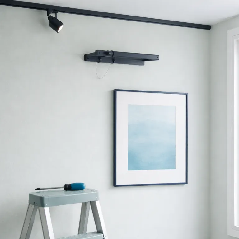
Choosing between picture lights, track LEDs, and recessed lighting is less about style and more about the specific artwork in the room. A slim picture light mounted on the wall above a framed piece can work beautifully for a single hero painting, yet it often fails for large artworks or salon-style hanging where multiple artworks compete for the same narrow beam of light. Track lighting and flexible gallery lighting systems give you more control over beam spread, angle, and color temperature across an entire wall.
For ceilings under 2.7 metres, picture lights or short-arm wall fixtures keep the beam tight and avoid grazing the ceiling with stray light that makes the room feel lower. Once you move into higher ceilings, a ceiling-mounted track with adjustable LED heads lets you treat the space more like professional art galleries, where each artwork receives its own accent lighting and the overall lighting design reads as a calm, even field. In long corridors or open-plan living room layouts, recessed lighting with wall-wash trims can create a soft, natural light effect that flatters large works and photography without the visual clutter of exposed fixtures.
When you plan a project heavy on art, sketch the wall elevations and mark each artwork, then overlay the proposed lights, track positions, and beam angles before you speak to your lighting designer or électricien. This drawing becomes your spec for art lighting at home, the same way a framer relies on a conservation spec sheet for glazing and mats; for framing details you can use a conservation-grade spec guide as a reference in parallel with your lighting plan, similar to a framing and decor brief you might prepare when you coordinate color and proportion. Treat the whole room as a single gallery, where each light, each track, and each fixture serves the artworks rather than the catalogue photograph.
The 30 degree rule, shadows, and color temperature
Most museum and gallery lighting starts from a simple rule: aim the beam at roughly 30 degrees from vertical so the light clears the viewer’s head and minimises glare on glass. That 30 degree angle is a baseline, not a law, and textured paintings with heavy impasto or collage often look better with slightly raking light at 35 to 45 degrees that pulls shadows across the surface and reveals the sculptural quality of the paint. Flat works on paper, by contrast, prefer a softer, more frontal lighting art approach that avoids deep shadows and keeps the paper tone even from edge to edge.
Color temperature is where many otherwise sophisticated interiors fail, because a mismatch between wall paint, ceiling lights, and artwork lighting can make a blue sky go cyan or a warm skin tone turn sallow. For most oil paintings and warm-toned interiors, an LED source around 2700 to 3000 kelvin feels closest to traditional halogen, while photography and works on paper often benefit from a neutral 3500 to 4000 kelvin that keeps whites clean without going clinical. Whatever temperature you choose, insist on high quality color rendering with a CRI of 95 or higher, or TM‑30 Rf values in the mid‑90s, so the pigments in your art read with accurate color and the subtle differences between similar hues remain legible; this aligns with guidance from conservation departments at institutions such as the Tate and the National Gallery, which emphasise both color fidelity and controlled exposure.
In a living room with mixed uses, consider layering: use warm ceiling fixtures for general lighting, then specify slightly cooler gallery lighting on a dimmable track for contemporary artworks and LED art that rely on crisp whites. When you brief your lighting designer, state explicitly the desired color temperature range, the target lux levels for each artwork type, and whether any pieces are light sensitive, then share a framing spec such as a conservation framing guide for fine art prints so the glazing and lighting strategy align. The more precise your language about lighting fixtures, color rendering, and art lighting priorities, the less you leave to guesswork on site.
DIY aiming, sculptural fixtures, and wireless control
Even with a perfect spec on paper, the final character of art lighting design at home comes from how you aim and dim the lights on installation day. Stand where a viewer will stand, hold the remote or dimmer, and adjust each track head until the beam just kisses the frame edges without spilling too far onto the wall or ceiling. For textured artworks and sculpture, walk the room and watch how shadows move as you tweak the angle, because a few degrees can turn a flat object into a three-dimensional presence.
Sculpture needs at least three sources at different heights: one key light for form, a softer fill to open the shadows, and a back or side accent lighting source to separate the piece from the wall behind it. In practice, that might mean a ceiling-mounted track head, a low floor lamp with a tight beam, and a small wall-mounted spotlight, all on separate circuits or wireless controls so you can tune the balance for day and night. This layered approach echoes museum practice, where gallery lighting rarely relies on a single fixture, and it works just as well in a domestic room with a single important object on a plinth.
Wireless control systems now let you group lights by artwork rather than by room, so one button press can shift the mood from daytime natural light emphasis to evening lighting art emphasis. When you specify fixtures, ask about wireless dimming compatibility, beam angle options, and whether the LED modules are field-replaceable, because that affects long-term maintenance and total price over the life of the system. Think of the fixtures themselves as part of the artwork: sculptural pendants from makers such as Apparatus, Hammerton, or Lindsey Adelman can read as LED art in their own right, provided they do not throw distracting glare onto nearby paintings.
Wall color, room context, and briefing your équipe
Wall color and finish quietly shape how every artwork reads, sometimes more than the choice of lights or fixtures. A deep matte wall absorbs stray light and makes a painting’s highlights pop, while a glossy pale wall bounces light back into the room and can wash out subtle mid tones in delicate artworks. When you repaint a room that already functions as a gallery, revisit the lighting design at the same time, because the new wall color may demand different color temperature choices or more controlled accent lighting.
Context matters: a small art gallery with white walls and a 3 metre ceiling behaves very differently from a low-ceilinged living room with mixed furniture, windows, and reflective surfaces. In residential projects, natural light from windows or skylights can be both a gift and a threat, offering beautiful daytime lighting ideas while also introducing UV and heat that can damage sensitive art over time. Use blinds, UV-filtering glazing, and careful placement of artworks away from direct beams, then let your LED gallery lighting take over in the evening with consistent, controllable illumination.
When you brief your équipe of interior design and lighting professionals, be specific about the collection: list each artwork, its medium, its approximate value or price bracket, and any conservation concerns, then share reference documents such as a conservation-grade framing spec sheet so framing and lighting decisions support each other. Ask your lighting designer to provide a circuit schedule that separates artwork lighting from general room lighting, with dimming curves tuned for both LED art and traditional media, and insist on mock ups in at least one room before committing to a full house install. In the end, the test of any art lighting design at home is simple: the work should look truer, richer, and more itself under your lights than it did in the art gallery where you first fell for it.
FAQ
What is the best color temperature for lighting paintings at home ?
For most oil and acrylic paintings in a domestic setting, a warm white LED between 2700 and 3000 kelvin usually offers the most flattering balance between warmth and clarity. This range echoes traditional halogen gallery lighting while avoiding the yellow cast of older incandescent bulbs. Always pair that color temperature with a CRI of 95 or higher, or a TM‑30 Rf in the 90s, to maintain accurate color and subtle tonal transitions.
How bright should artwork lighting be in a living room ?
As a rule of thumb, aim for 150 to 200 lux on the surface of oil or acrylic paintings, which is bright enough to reveal detail without feeling harsh in a mixed-use room. Works on paper, drawings, and prints should sit closer to 50 lux, especially if they have delicate pigments or historic paper. Sculpture and robust contemporary pieces can tolerate higher levels, but always test with dimmers to find a comfortable balance with the rest of the room lighting.
Are picture lights bad for conservation ?
Modern LED picture lights with near zero UV output are generally safe for most contemporary artworks when used at moderate brightness and reasonable distances. Problems arise with older halogen or incandescent picture lights that generate significant heat and UV, which can accelerate fading and damage to sensitive materials. If you use picture lights, choose high quality LED models with good color rendering and keep them on dimmers and timers to limit exposure.
Should I prioritise natural light or artificial gallery lighting ?
Natural light can make artworks look luminous during the day, but it is inconsistent and can introduce UV and heat that harm sensitive pieces over time. Controlled artificial gallery lighting using LED fixtures allows you to set precise color temperature, intensity, and beam spread for each artwork, day or night. The most effective strategy combines both: manage natural light with blinds and glazing, then rely on tuned artificial lighting art to provide consistent viewing conditions.
What should I tell my electrician when planning art lighting design at home ?
Provide your électricien with scaled wall elevations showing artwork positions, preferred fixture types such as track lighting, recessed lighting, or picture lights, and the desired circuit separation between artwork lighting and general room lighting. Specify LED fixtures with a CRI of at least 95, the target color temperature range for each room, and any wireless control requirements. Ask for adjustable fixtures wherever possible, so you can fine tune beam angles and accent lighting once the artworks are installed.
Art lighting specification cheat sheet
Use this condensed reference when you plan your layout or brief a lighting designer. Values are typical museum-inspired targets for residential spaces; always adjust for specific conservation advice and the sensitivity of individual works.
| Medium / Situation | Target illuminance (lux) | Recommended CRI | Typical color temperature (K) | Usual beam approach | Example fixture types |
|---|---|---|---|---|---|
| Oil & acrylic paintings | 150–200 lux | ≥ 95 | 2700–3000 K | 30° accent from ceiling track or wall | Adjustable LED track spot, high-CRI picture light |
| Works on paper, drawings, prints | 30–50 lux | ≥ 95 | 3000–4000 K | Soft, wider beam, minimal raking | Track spot with diffuser, recessed wall-wash |
| Photography | 100–150 lux | ≥ 95 | 3500–4000 K | Even wash, controlled reflections | Linear wall-wash, adjustable LED downlight |
| Sculpture & objects | 200–300 lux | ≥ 90 | 2700–3500 K | Three-point (key, fill, back) | Track spots at varied heights, floor accent |
| Light-sensitive or historic works | ≤ 50 lux | ≥ 95 | 3000–3500 K | Very soft, indirect, no direct sun | Low-output LED with dimmer, shielded wall-wash |
These ranges echo principles found in IES museum lighting recommendations and conservation literature, which balance visual clarity with long-term preservation and often reference cumulative exposure in lux-hours rather than brightness alone.
Simple wall-elevation diagram (text description)
Imagine a straight wall 4 metres long with three framed artworks. Draw a rectangle for the wall, then three smaller rectangles in a row to represent the frames. Above the drawing, sketch a parallel line 0.8 metres out from the wall to represent a ceiling track. Mark three track heads on that line, each centred on a frame. From each head, draw a line down to the centre of its artwork at roughly a 30° angle from vertical. Label the heads with beam angles (for example, 20° for a small piece, 30° for a medium one, 40° for a large canvas) and note the target lux from the table. As a worked example, a 30° beam from a track 2.7 metres high will comfortably light a painting whose centre sits about 1.5 metres above the floor and roughly 1.5 metres below the ceiling, so the bright core of the beam lands on the artwork rather than the floor. This quick elevation becomes a shared language between you, your lighting designer, and your électricien when you position tracks, choose optics, and set dimmer levels.