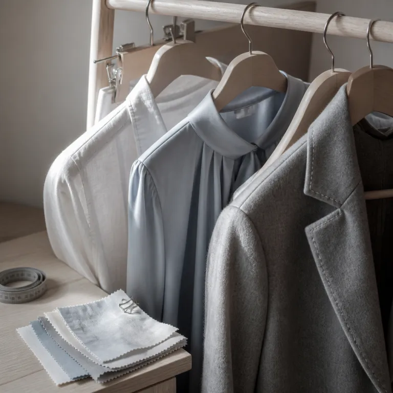
Translating art connoisseurship into what you wear for a photoshoot
Choosing how to pick outfits for photoshoots is not so different from curating a private collection. When you plan what to wear for a photoshoot in a gallery, studio, or residence filled with luxury artwork, you are effectively composing a moving colour palette that must respect the art, the architecture, and the light. Think of every outfit as a small canvas that needs harmony of colours, texture, and line.
Start with the space where the photo session will unfold, then study the dominant colours and materials in the artworks and interiors, because the most successful photoshoot outfits echo the environment without copying it. A deep blue silk dress in front of a Rothko inspired colour field, or a cream linen suit against travertine and bronze sculpture, lets the image breathe while still giving the photographer room to frame refined family portraits or a single close-up. When you plan what to wear image by image, you avoid the visual noise that often ruins otherwise exquisite pictures.
For a collector’s family session in a home hung with large abstract canvases, avoid tiny prints that will clash in the final family photo album. Instead, build a restrained color scheme of three to four colours, then vary saturation and texture across each outfit so that every group portrait feels cohesive yet individual. This approach to coordinated wardrobe planning works equally well for an extended family gathering in a sculpture garden or a quiet photo shoot in a minimalist penthouse.
Building a gallery worthy colour palette for family photoshoots
Luxury artwork lovers already understand that a disciplined colour palette can elevate even the simplest composition. Apply the same discipline when deciding how to pick outfits for photoshoots, especially when you are coordinating a family photoshoot or a multi generation family session around a significant piece of art. Begin by selecting one anchor colour, one supporting neutral, and one accent, then repeat these colours thoughtfully across every outfit.
For example, if a favourite painting features deep blue, sand, and ivory, let blue appear in one person’s dress, another person’s pocket square, and perhaps a child’s knit, while sand and ivory flow through trousers, shirts, and accessories for the whole family. This creates a subtle colour palette that flatters skin tones and keeps the focus on expressions in every family photo, rather than on clashing colors that distract from the art on the walls. When you review the final sequence of images, the repetition of related colours will feel as intentional as a series of works by a single artist.
Beach family portraits around a coastal collection of marine inspired paintings benefit from the same restraint, so keep beach family outfits in soft blues, stone greys, and warm whites instead of loud neons. If you are planning fall family images in a sculpture park, echo the season with rust, forest green, and muted mustard, but avoid matching every outfit exactly so the pictures retain depth. For collectors who also invest in animal artwork for refined interiors, coordinating earthy colours and tactile fabrics can visually link the subjects in the photo shoot to the artworks that share the room, as explored in this analysis of animal artwork as a refined statement in contemporary luxury interiors.
Composing outfits like diptychs and triptychs for different sessions
When you think about how to pick outfits for photoshoots across multiple photo sessions, imagine each session as a diptych or triptych in a larger series. A single photo session might focus on a couple in front of a favourite canvas, while a later family session brings in children, grandparents, and even an extended family branch, all photographed among the same works. The goal is to ensure that every photo shoot feels related, even if the outfits evolve over time.
For the first session, keep photo outfits understated and timeless, using a neutral color scheme such as charcoal, cream, and soft blue that will age gracefully alongside the art. In subsequent photo sessions, you can introduce bolder colours or a more daring style, but always maintain one repeating element, such as a recurring colour or fabric, so that the series of photos looks curated rather than improvised. This strategy is particularly effective when you plan to frame several pictures together in a hallway or salon, where visual continuity matters as much as it does in a museum hang.
Collectors who commission conservation grade framing for their fine art prints understand the value of long term thinking, and the same mindset should guide your wardrobe planning. Just as a framer follows a detailed specification sheet to protect a print, you can follow a personal wardrobe spec for each photo session, considering fabric longevity, colour fastness, and how garments will photograph under different lighting conditions, as outlined in this guide to framing fine art prints properly. When you later review the full sequence of family memories, the consistent visual language across outfits will feel as deliberate as the framing choices around your artwork.
Balancing individual style and family harmony in luxury settings
One of the most nuanced aspects of how to pick outfits for photoshoots in art filled spaces is balancing personal style with collective harmony. Each person in the family wants to feel authentically themselves in the photos, yet the overall effect must remain as cohesive as a thoughtfully curated salon wall. The solution lies in defining a shared aesthetic direction, then allowing individual variations within that framework.
Start by agreeing on the level of formality for the photo shoot, whether that means black tie elegance among Old Masters, relaxed tailoring around contemporary installations, or barefoot chic for a beach family portrait near a seaside villa. Once the formality is set, assign each family member a role within the visual composition, such as one person in a statement dress, another in a textured knit, and others in quieter supporting outfits that echo the chosen colours. This approach ensures that no single outfit overwhelms the photo, while still allowing personality to shine through in every family picture.
When coordinating outfits across the whole family, pay attention to how fabrics interact with the artworks and the light, avoiding high shine materials that may reflect gallery spots or large mirrors. Encourage each person to bring two outfit options to the photo session, so the photographer can adjust the balance of colours and textures on site if needed. Over time, as you build a library of family photos taken in different rooms and collections, you will see how this careful planning of what to wear together creates a visual narrative as rich as the art itself.
Seasonal and location specific outfit strategies for art centric shoots
Season and location play a decisive role in how to pick outfits for photoshoots that unfold around luxury artwork. A fall family portrait in a sculpture park demands different choices from a summer beach family session near a modernist villa or a winter shoot in a marble clad gallery. Each context influences not only colour choices but also fabric weight, layering, and the overall mood of the pictures.
For fall family photos among bronzes and turning leaves, lean into rich colours like burgundy, forest green, and deep blue, but temper them with soft neutrals so the outfits do not compete with the warm tones of the landscape. Layering tailored coats, cashmere knits, and structured boots adds depth to the photos, while still allowing the photographer to capture clean lines and elegant silhouettes during the photo shoot. In contrast, a summer beach family photo session near a collection of coastal artworks calls for lighter fabrics, airy dresses, and a color scheme of soft blues, sands, and creams that echo both the sea and the art.
Urban sessions in private galleries or art fairs require yet another strategy, often favouring monochrome outfits with a single accent colour to avoid clashing with diverse artworks. Here, a family photoshoot might feature black, white, and grey outfits with one recurring blue or rust accent, ensuring that the photos remain timeless even as art trends evolve. When planning multiple photo sessions across seasons, keep a record of previous outfits so that each new session adds a fresh chapter to your visual story without repeating the same colour palette too closely.
From camera to collection wall: planning photos as future artworks
For luxury artwork lovers, the ultimate aim of understanding how to pick outfits for photoshoots is to create images worthy of hanging alongside paintings, sculptures, and photography in a personal collection. This means thinking beyond the camera and imagining how each photo will live on the wall, in a book, or in a digital archive. Wardrobe choices become part of the long term aesthetic of your home, not just a fleeting fashion statement.
When you commission a photographer for a family photoshoot in a residence filled with museum quality works, discuss in advance where the final family photos or individual portraits might be displayed. If a family picture is destined for a panelled library, you may favour deeper colours and classic tailoring, while a series of beach family images for a light filled corridor might call for softer colours and relaxed outfits. Aligning outfit choices with the intended display location ensures that the photos integrate seamlessly into your existing art hang.
Collectors who care about institutional collecting and representation often think about how personal imagery contributes to a broader cultural narrative. The same intentionality can guide your wardrobe planning, as you consider how each photo session reflects your values, relationships, and aesthetic preferences, a perspective that resonates with this reflection on why institutional collecting of women artists matters more than auction prices. Over time, a series of thoughtfully styled family portraits can become a parallel collection, one that documents not only your life with art but also the evolving style and colour sensibility of your family across decades.
Key statistics on photography, colour, and visual perception
- Research in colour psychology and visual marketing, including work cited by the Pantone Color Institute and the International Journal of Photography and Imaging, indicates that viewers form an impression of an image within seconds, and a large share of that response is driven by colour, which helps explain why a disciplined colour scheme for photo outfits has such impact.
- Industry surveys of portrait clients, reported by professional photography associations and leading studios, suggest that coordinated colours in group portraits are consistently described as more harmonious and polished than similar images where outfits were not planned.
- Professional photography associations report that a growing proportion of high end family session bookings now include a dedicated styling consultation, reflecting how clients increasingly view wardrobe planning as integral to the creative process.
- Usability and eye tracking research, summarised in visual perception and imaging journals, indicates that viewers spend most of their time on faces rather than backgrounds, yet strong colour clashes in clothing can still pull attention away from expressions and weaken emotional impact.
- Leading print labs and fine art printers observe that neutral and blue dominant colour palettes are chosen for framed family photos far more often than very bright palettes, because they integrate more easily into a range of interior design schemes.
FAQ: how to pick outfits for photoshoots in art rich spaces
How many colours should I use for a coordinated family photoshoot ?
For a refined family photoshoot, limit your palette to three or four main colours, including at least one neutral, then repeat them across outfits with varying textures and shades. This keeps the photos cohesive without feeling overly matched. In art filled spaces, fewer colours help the eye move gracefully between subjects and artworks.
What outfits work best for a beach family photo session near luxury villas ?
For a beach family photo session, choose light, breathable fabrics in soft blues, sands, creams, and gentle greys that echo the sea and sky. Avoid busy patterns and neon colours, which can clash with both the natural environment and any coastal artworks nearby. Barefoot or simple leather sandals usually photograph better than bulky shoes on sand.
Should our outfits match the colours of the artworks behind us ?
Rather than matching artworks exactly, aim to complement them by echoing one or two key colours at lower saturation. If a painting features intense blue and gold, you might wear a muted blue dress and warm beige accessories instead of bright primary tones. This approach keeps the focus on faces while still creating a visual dialogue with the art.
What fabrics photograph best in galleries and private collections ?
Matte fabrics such as wool, cotton, silk crepe, and fine cashmere generally photograph better than high shine materials, which can reflect gallery lighting and create hotspots. Subtle textures add depth to photos without competing with the artworks. Avoid overly stiff fabrics that restrict movement, as natural posture and ease are essential in luxury portraiture.
How far in advance should I plan outfits for a high end family session ?
For a high end family session in an art rich environment, start planning outfits at least three to four weeks in advance. This allows time for fittings, tailoring, and test photos in similar lighting conditions. Early planning also lets you coordinate with your photographer and, if needed, a stylist to ensure harmony between wardrobe, artworks, and interiors.
References
- Pantone Color Institute
- International Journal of Photography and Imaging
- Association of Photographers