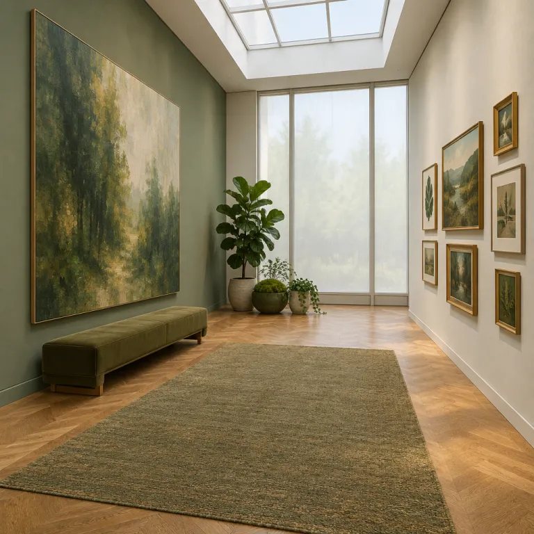
Art scale interior design home: starting with the architecture, not the artwork
Scale is the first decision in any serious art interior project, and it should come from the room before it comes from the artist. In a luxury home the architecture, the negative space around openings, and the existing furniture layout quietly dictate whether one large scale piece or a conversation of smaller pieces will let the space breathe. When you treat scale as a response to architecture rather than a mood, every room feel becomes intentional instead of accidental.
Begin by reading the room as an interior designer would, mapping wall widths, ceiling heights, and key architectural elements such as fireplaces, pilasters, and window bays. For a single statement work, a reliable rule is that the artwork width should sit around sixty to seventy five percent of the available wall, leaving enough negative space at the sides to create sense of calm rather than crowding. This simple proportion works in both small and large spaces, from a compact living room to a gallery like dining room with generous wall expanses.
Height matters as much as width when you calibrate scale proportion in any interior design scheme, especially in a tall living space where a timid piece will visually collapse the wall. In a typical art scale interior design home, the vertical center of the piece should sit near eye level, but in a room with very high ceilings you can stretch the artwork upward to acknowledge the full scale interior volume. That shift alone can transform a merely pleasant room into one with a clear focal point and a confident sense of proportion.
The single statement: one large work as the room’s primary voice
Some rooms ask for one voice, not a chorus, and that is where a single large piece becomes the natural focal point. Think of a long, uninterrupted wall behind a sofa in a living room or above a console in an entry, where one large scale work can align with the furniture and anchor the entire space. When the artwork is correctly sized, the room feel shifts from scattered to composed, and the eye finally has a place to rest.
For a sofa that is two point four meters wide, a large piece between one point five and one point eight meters usually hits the right proportion, leaving enough negative space at the edges to frame the art home story without overwhelming the wall. Interior designers often work with a viewing distance of at least one and a half times the diagonal of the artwork, which keeps brushwork legible while preserving overall visual interest from across the room. This is especially important with black white compositions or highly textured wall art, where detail and impact must balance at both close and long range.
In a dining room the same logic applies, but the relationship to the table and chairs changes the scale decision and the interior design rhythm. The artwork should not compete with the furniture silhouettes at seated eye level, so a slightly narrower piece with strong focal points often reads better than an over wide canvas. When you light that single work correctly with a dedicated picture light or a tailored track system, as outlined in this lighting specification for every artwork in the room, the entire interior can feel curated rather than merely decorated.
The conversational approach: grids, salon hangs, and linear stories
Other spaces thrive on dialogue, and here multiple pieces arranged in a grid, salon hang, or linear run can create sense of movement across the wall. This conversational approach suits long corridors, transitional spaces, and more intimate corners of the home where one large work would feel overbearing. By treating several artworks as one extended composition, you can tune both scale proportion and visual interest with surprising precision.
A grid of four or six works above a sideboard in the living room, each with consistent framing and aligned sight lines, reads as a single large scale rectangle while still allowing individual pieces to speak. Salon style arrangements, where frames climb higher and dip lower, work best when the outer silhouette respects the main architectural elements and leaves enough negative space at the ceiling and floor. For clients experimenting with colour and mood, I often point them to thoughtful resources on seasonal palettes, such as these inspiring paint ideas for luxury artwork lovers, then translate those tones into a coherent wall art story.
Linear runs of works along a hallway or above a low piece of furniture can guide movement through the interior and subtly elongate the space. Here the art scale interior design home question is less about one focal point and more about a sequence of smaller focal points that echo the rhythm of doors and openings. Interior designers who master this conversational hanging style can make even modest spaces feel layered, personal, and quietly luxurious.
Room by room: matching art scale to function, furniture, and sight lines
Scale decisions become sharper when you consider how each room is actually used, not just how it photographs, and that is where professional interior designers earn their fee. In a living room where people sit three to four meters from the main wall, a single large piece or a tight grouping with a strong focal point will usually outperform a scattering of small works. The goal is to create sense of cohesion between the seating furniture, the wall art, and the architectural elements so the entire space feels like one resolved composition.
Bedrooms often benefit from softer scale interior moves, such as a horizontally oriented artwork above the headboard that spans roughly two thirds of its width, leaving negative space at the sides for lamps and textiles to breathe. In smaller rooms a pair of vertically stacked pieces can stretch the wall height without overwhelming the floor area, especially when the palette leans toward black white or muted tones. Corridors, by contrast, reward a sequence of medium sized pieces hung slightly lower, where the viewing distance is short and the artwork must read clearly at a quick walking pace.
Open plan spaces in a contemporary art scale interior design home present the hardest test, because one wall can be seen from the kitchen, the dining room, and the main living area simultaneously. Here I often specify one commanding large scale work as the anchor, then support it with quieter pieces that echo its colours or forms without competing as focal points. When this hierarchy is clear, every room feel within the larger volume remains distinct yet connected, and the home decor narrative gains both depth and clarity.
The designer’s brief: guiding collectors on scale without dictating taste
For interior designers and art consultants, the real craft lies in translating architectural facts into a clear brief that still leaves room for the collector’s taste. I start every art scale interior design home conversation with hard numbers, sketching wall dimensions, furniture positions, and ideal artwork sizes before we ever talk about artists or styles. That framework lets clients choose between black white photography, gestural painting, or sculptural wall pieces while knowing each option will sit correctly in the space.
When a project calls for one large piece, I present two or three candidates at the right scale proportion, often including both colour rich works and more restrained options so the collector can steer the mood. For rooms that want a conversation between several pieces, I show layouts for grids, linear runs, or asymmetrical clusters, each with a different balance of focal points and supporting works. This is also where I discuss long term collection strategy, pointing clients toward thoughtful perspectives on institutional collecting, such as this analysis of why institutional support for women artists matters more than auction prices.
In every case the brief is about proportion, negative space, and how the artwork will live with the furniture and the daily rituals of the home. A well scaled piece in the dining room should hold its own against glassware, candlelight, and conversation without shouting over them, while a living room anchor work must remain compelling from morning coffee to late night reading. The most successful projects remember that luxury is not the certificate on the back of the canvas, but the wall it earns and the room it quietly transforms.
FAQ
How wide should a single artwork be above a sofa or console ?
For a balanced room feel, aim for an artwork width between sixty and seventy five percent of the furniture piece below it. This keeps enough negative space at the sides to frame the art without making the wall feel cramped. The same guideline works for both living room sofas and slim consoles in an entry.
When is one large work better than a gallery wall ?
One large work suits rooms with strong architectural elements and clear sight lines, such as a main living room wall opposite the primary seating. A single focal point keeps the interior calm and lets furniture and decor read as one composition. Gallery walls or salon hangs work better in transitional spaces, corridors, or more intimate rooms where a conversational mix of pieces adds energy.
How do I choose art scale for a small room without overwhelming it ?
In a small room, one medium to large piece often feels calmer than many tiny works scattered across the walls. Keep the artwork slightly narrower than the main furniture item and leave generous negative space around it to create sense of air. Light palettes, black white photography, or restrained colour fields can help the space feel larger and more coherent.
What is the ideal viewing distance for large scale artworks at home ?
A practical rule is to allow at least one and a half times the diagonal of the artwork as a viewing distance. This lets you appreciate both overall composition and detail without visual strain. In open plan interiors, check the distance from the main seating or dining positions rather than from the nearest wall.
How can I mix different artworks while keeping visual coherence ?
Choose one or two constants, such as a shared colour family, similar frame profiles, or a consistent bottom alignment across the wall. Treat the group as a single large piece by sketching its outer silhouette and respecting the room’s architectural elements. This approach preserves visual interest while keeping the interior design language controlled and elegant.